
Floor Plans That Help Homes Sell Faster (What Buyers Actually Use)
Buyers use floor plans to judge layout, flow and furniture fit before they book a viewing. Here is how to produce clear plans that support faster sales — from sketch to professional drawing.
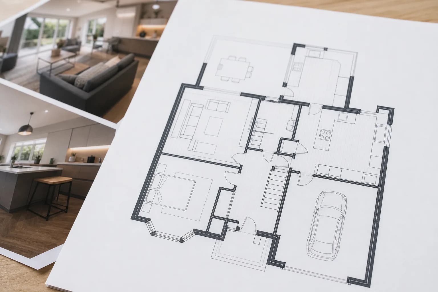
Key Takeaways
- Floor plans answer layout questions photos alone cannot — especially for flats and extended houses.
- [object Object]
- Publish the plan early in the gallery and on your own property page.
- Fast sketch-to-plan workflows keep instructions moving when survey delays would hurt momentum.
- Interactive plans add another layer for premium and new-build marketing.
Photos show atmosphere. Floor plans show truth.
Buyers scrolling on a phone want to know whether the sofa fits, whether bedrooms are genuinely doubles, and how the kitchen connects to the garden. When those answers are missing, they either book speculative viewings or skip the listing entirely. Neither outcome helps you sell faster.
This guide explains what buyers actually do with plans, how to produce them without slowing the instruction, and where tools like Sketchplan and Planos fit a modern ReHub Studio workflow.
What buyers use floor plans for
In practice, buyers use plans to:
- Compare room sizes across competing listings
- Check bedroom count against real usability
- Understand open-plan versus separated living
- Spot awkward corridors, through-rooms or missing storage
- Plan furniture before the first visit
- Brief partners who have not seen the photos yet
A plan that supports those jobs earns its place. A decorative diagram that hides dimensions and mislabels rooms creates complaints later.
Why plans speed up the sale
Faster sales rarely come from one magic asset. They come from fewer frictions:
- Better shortlisting — the right people book viewings.
- Shorter decision cycles — couples align sooner when layout is clear.
- Stronger offers — buyers feel informed, not surprised on arrival.
- Fewer fall-through risks — layout surprises are a classic cooling-off trigger.
Pair a clear plan with a sharp first portal image and you cover both emotion and logistics.
Anatomy of a high-performing listing plan
Keep the visual language simple
- Black or dark grey walls on a white or near-white background
- Consistent door swings
- Clear room names in plain English
- Dimensions on key rooms (or a scale bar the eye can trust)
- Minimal furniture icons — only if they aid scale, never if they clutter
Ornate compass roses, heavy textures and tiny fonts look impressive in a PDF and illegible on a phone.
Label for real life
Use names buyers recognise: “Kitchen / Dining”, “Bedroom 2”, “Family Bathroom”. Avoid internal codes or overly clever lifestyle labels that obscure what the room is.
Show the whole storey
Split levels and rear extensions need enough context that the plan does not feel like disconnected boxes. If a second storey exists, present both floors clearly.
Be honest about approximate plans
If a plan is indicative, say so. Accuracy builds trust; overclaiming damages it when a buyer arrives with a tape measure.
Sketch to professional plan without delaying launch
Many agencies lose days waiting for a perfect measured survey before they will publish anything. A smarter sequence:
- Capture a careful sketch or on-site notes at photography.
- Produce a clean listing plan quickly with Sketchplan.
- Go live with photos, plan and description together.
- Upgrade to a fully measured plan later if the instruction or price point needs it.
Momentum matters. An empty “floor plan coming soon” slot is a missed conversion opportunity on day one.
Where to place the plan in your marketing
- Portal gallery: within the first third of images, not buried at the end
- Brochure / PDF: opposite or immediately after the hero spread
- Property microsite: persistent module beside the gallery — ideal in Showcase
- Social: a clean plan graphic as a carousel slide after the hero photo
- Appraisal pitch: show the standard you will deliver if instructed
Static plans vs interactive plans
A static plan answers “what is the layout?”
An interactive plan answers “how do the rooms relate to the photos and tour?”
Planos adds clickable hotspots so buyers can jump from plan to image or space — particularly useful for new builds, larger homes and overseas buyers who cannot view easily. For a deeper comparison, see interactive floor plans vs static PDFs.
Use static plans as the default. Upgrade to interactive when the property’s complexity or price justifies the extra clarity.
Common floor plan mistakes
Pretty but unreadable. Fine lines and pale greys disappear on mobile.
Missing dimensions everywhere. Buyers then treat the plan as guesswork.
Inconsistent style across branches. Makes the agency look fragmented.
Publishing the surveyor’s raw CAD export. Technically accurate, visually hostile.
Ignoring gardens and parking. Outdoor space often decides the shortlist — show it.
A branch standard you can enforce
Write a one-page media rule:
- Every residential listing ships with a plan unless legally blocked
- Approved template styles only
- Mobile legibility check before upload
- Plan appears before image 8 in the portal set
- Sketchplan / measured survey path defined by price band
Standards remove debate. Negotiators stop improvising; buyers get a consistent experience.
How plans fit the rest of the package
Think of the listing as layers:
- Hero photo for the click
- Gallery for emotion
- Floor plan for logic
- Video for pace and story
- Tour for immersion
- Microsite for deeper conversion
ReHub Studio connects several of those layers — including sketch-to-plan — so production does not require a different login for every asset type. Explore the wider connected ecosystem if you are still assembling tools piece by piece.
Practical checklist before you publish
- Both floors shown where relevant
- Room labels clear at phone size
- Key dimensions or trustworthy scale present
- Outdoor space included
- Style matches agency template
- Indicative / measured status stated if needed
- Plan placed early in the gallery
- PDF brochure uses the same artwork
Room dimensions buyers actually look for
Not every wall needs a measurement. Buyers scan for the rooms that decide whether they book a viewing:
- Master bedroom — is it genuinely a double or a generous single?
- Living room — will a standard sofa and TV wall fit without guessing?
- Kitchen — enough space for a table if the listing claims “kitchen/diner”?
- Second bedroom — critical for families comparing three-bed semis in the same postcode
- Garden depth — often the tie-breaker when floor area looks similar across rivals
Publish dimensions in metres (UK standard). Avoid mixing feet and metres on the same plan. If a room is irregular, show the longest usable dimension rather than a misleading maximum across a bay window recess.
For flats, include overall approximate internal area if your template allows — many buyers filter mentally on square footage before they read the description. For houses with extensions, make sure the plan shows the extension as part of the whole ground floor, not as a floating box disconnected from the original footprint.
How to brief Sketchplan from the valuation visit
You do not need a laser measure on day one to produce a useful listing plan. At valuation or first visit, capture:
- A rough sketch on paper or tablet showing room connections and door positions
- Pace counts or tape measurements for principal rooms (living, main bed, kitchen)
- Notes on split levels, steps, and anything non-obvious from photos alone
- Photographs of any existing estate agent plan or developer layout for reference
Upload the sketch to Sketchplan with clear labels. The turnaround is designed for listing speed, not building control — which is exactly the point. You are producing a marketing plan that helps buyers shortlist, not a document for a structural engineer.
When the measured survey arrives later, swap the artwork in the portal and microsite without changing the URL or brochure layout. Buyers who saved the listing see the upgraded plan automatically if your CMS supports it; on Showcase pages, updating the plan module takes minutes.
Plans for lettings vs sales — what changes
Lettings buyers move faster and often decide on layout before they commit to a viewing slot. A clear plan reduces wasted Saturday appointments — particularly important when the landlord pays for access and the tenant still occupies.
Sales buyers use plans to compare competing homes in the same price band. If your plan is missing while a rival’s is present, you lose the comparison before the first image is judged.
For HMOs and multi-let stock, show room boundaries and shared spaces explicitly. Ambiguity creates compliance questions and viewing no-shows.
Floor plans will not compensate for an overpriced home. They will help the right buyers recognise the right home faster — and that is often the difference between a quiet listing and a competitive one.
Frequently Asked Questions

The ReHub Studio Team
Property Marketing Experts
The ReHub Studio team builds AI-powered tools that help estate agents, photographers and developers create better property marketing, faster.
Ready to improve your property marketing?
Enhance photos, remove clutter, stage rooms, produce floor plans, create video and publish listings from one ReHub account.
Related Articles
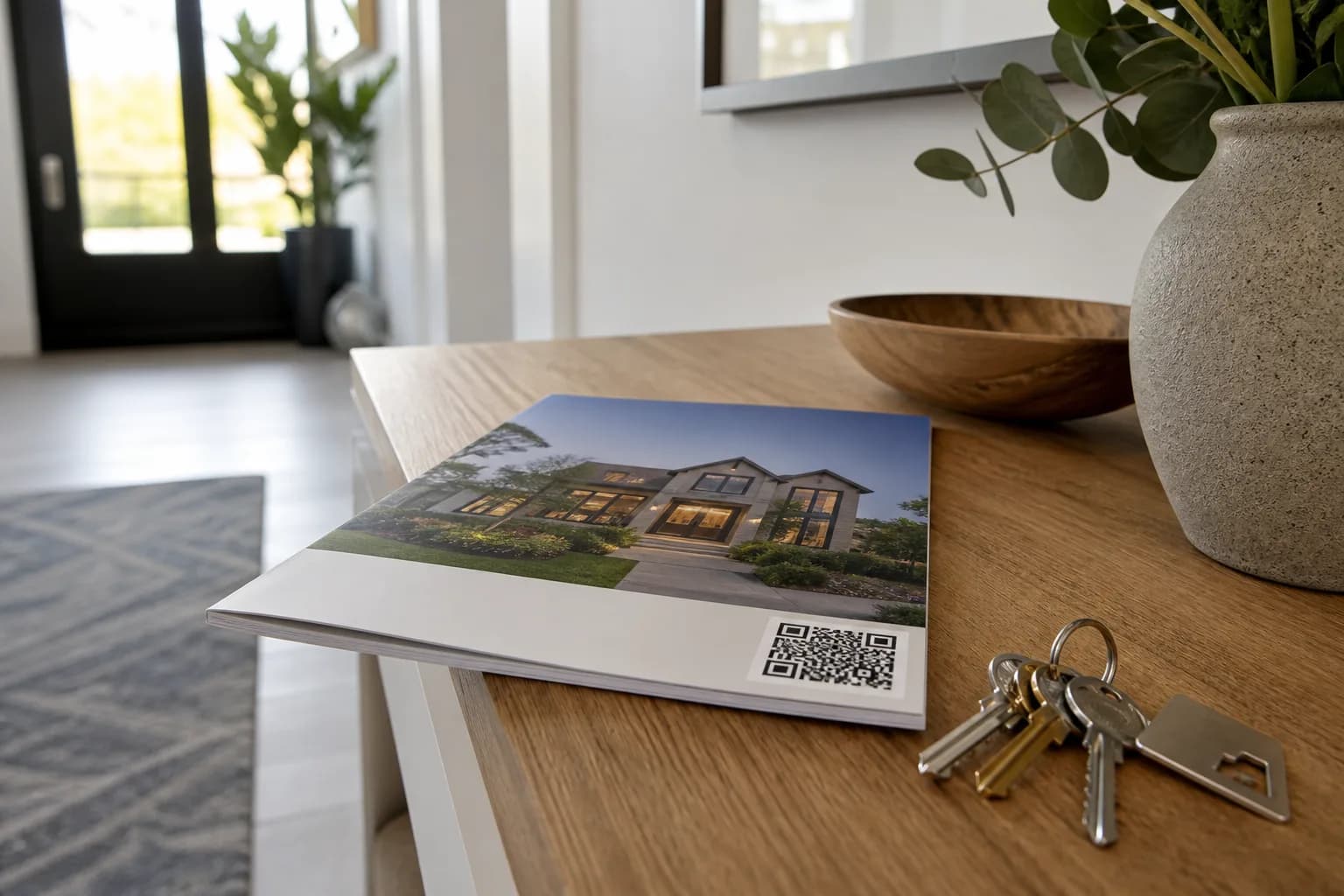
QR Codes and PDF Brochures That Turn Viewings into Enquiries
Boards, window cards and viewing folders still matter. Pair them with QR codes and smart PDF brochures so interest does not die when someone leaves the house.
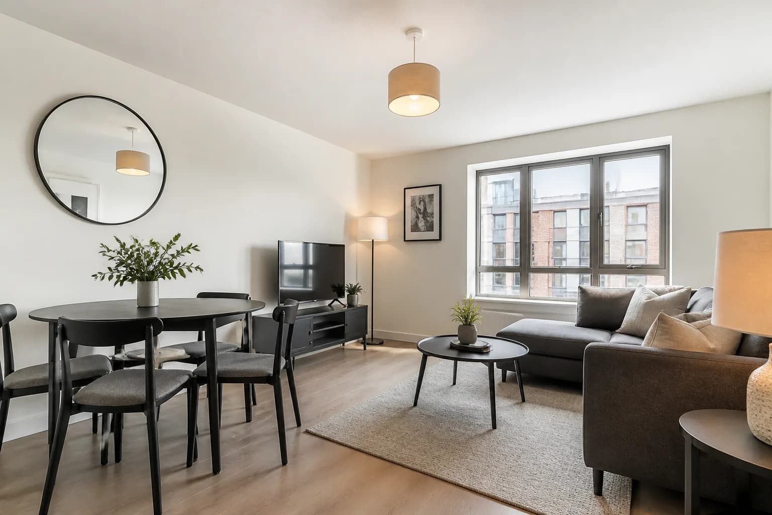
Lettings Marketing with AI Property Tools
Voids cost money. Learn how lettings teams use AI decluttering, staging, video and clearer photos to fill rentals faster without luxury-sale budgets.
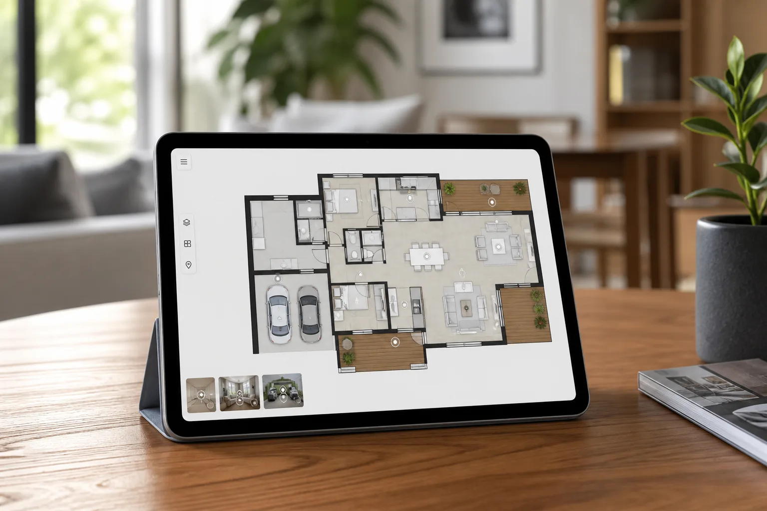
Interactive Floor Plans vs Static PDFs — Which Do Buyers Prefer?
Static plans still earn their place on portals. Interactive floor plans help buyers connect rooms to photos and tours. Here is how to choose — and when to offer both.